Altered State: Marijuana in California
April 16–September 25, 2016
ALTERED STATE was the first-ever museum exhibition to focus on marijuana in California. Designed as a catalyst for conversation and reflection around the marijuana plant, its uses, evolving public attitudes, and the complex policy and social issues surrounding it, the exhibition explored the many ways that people consider cannabis, presented through the perspectives, knowledge, and opinions of a diverse range of community members and groups.
The exhibit was the recipient of the 2016 Charles Redd Center for Western Studies Award for Exhibition Excellence, from the Western Museums Association. ALTERED STATE was also awarded 2017 Excellence in Exhibition, Special Achievement for "Civic Engagement; Respect of Audience from Multiple Viewpoints," specifically "design as a civic space for gathering, conversation and personal reflection" by the American Alliance of Museums.
I served as the lead designer on the project, providing concept and branding, exhibit design, exhibit graphics, and communications collateral.
Creative Direction | Identity + Mark | Illustration | Exhibit Design | Elevations | Graphic Design | Cartography
Special thanks to Kristen Angelo for the generous permission to feature some of her exhibit photos here. Kristen specializes in marijuana photography, and her work was featured in the exhibit. She may be found at A Pot Farmer’s Daughter.
IN GALLERY
The exhibit was divided into ten sections: CANNABIS SCIENCE, SPIRITUAL GANJA, PROFITABLE POT, EVIL WEED, CRIMINAL DOPE, MEDICAL MARIJUANA, CREATIVE GRASS, POLITICALLY LOADED, YOUTH & WEED, and RECREATIONAL REEFER. In order to provide context for these topics, but also to convey a sense of neutrality, this icon set became the primary visual for the exhibit identity.

The primary typeface for the exhibit was Hoefler & Co's infamous Gotham. Quotations only were set in Monotype's Scotch Roman Italic for a contrasting elegance.
The entrance into the gallery space was a kind of portal that narrowed on either side to place the central vitrine of live marijuana plants into sharp focus. Curatorial text was augmented with photographs of noted individuals and their diverse views on this controversial plant, ranging from Allen Ginsberg and Carl Sagan, to Miley Cyrus and Dr. Sanjay Gupta.
Beautifully housed in a well-lit custom enclosure designed and built by the museum, the live plants (provided and maintained by Dark Heart Nursery) provided a stunning centerpiece to the exhibit.
The icon set served as the basis for a wayfinding system. Each topic was given a section of the gallery space along the perimeter. After visitors orient to the vitrine housing live plants in the center of the gallery, a quick glance around the room provides them with options to engage and explore further. The totems at the entrance to each space are all framed as questions, followed by a brief summary.
CANNABIS SCIENCE

The only section neither on the periphery, nor introduced with a full totem, nor framed as a question, was CANNABIS SCIENCE. This section sat near the center of the gallery, just behind the vitrine of live plants.
Intended to be an objective examination of the plant from a purely biological perspective, CANNABIS SCIENCE was loaded with information design covering its domestication, cultivation, propagation, and ultimately hybridization by humans. Armed with these facts, visitors now had a common background with which to engage the more subjective topics about the gallery.
The interactive components and the overall structure were designed by Craig Hansen. Craig was uniquely suited to the task, having worked at the Lawrence Hall of Science for many years. He also contributed heavily to the MEDICAL MARIJUANA section.
Visitors were able to touch live plant matter through a glove box, observe plants cast in resin, and even compare the smells of various popular strains of "buds."
PROFITABLE POT?

PROFITABLE POT presented the sheer size and scope of the billion-dollar Marijuana Economy in California. There is something iconic about Benjamin Franklin's smirk on the 100 dollar bill, so we used him as the primary icon in the space, at massive scale. Other elements are interwoven throughout.
Known internally to the exhibit team as the "Noise Wall" or "Density Wall," this composition was designed by our good friend Tom Klump. Conveying the diversity of legal products available (both inside and outside California) was a daunting proposition, but the end result communicated the vibrancy we were looking for.
A double-sided 'portal' vitrine embedded in this Density Wall connected the PROFITABLE POT section with the adjacent MEDICAL MARIJUANA component of the exhibit. Thus the same buds could be viewed from either perspective.
The density wall was custom-built with three planes of depth, multiplying the cacophony effect.
The exhibit showcased several bits of information design. Here is a visualization of the supply chain for both legal and illegal grows and how they come to be sold at California medical dispensaries.

One of two "Wheels of Fortune" in the exhibit; the wheel for PROFITABLE POT presents visitors with various outcomes if they were to participate in California's marijuana economy.
I took great pleasure in this one-off piece. Representing a literal 'CALIFORNIA MARIJUANA NOTE,' this custom $100 bill is double-sided and features elaborate pot leaf artwork in the style of U.S. currency engraving, in addition to both my own signature (as Secretary of the Treasury) and the Director and CEO of the Oakland Museum of California, Lori Fogerty (as Treasurer of the United States).
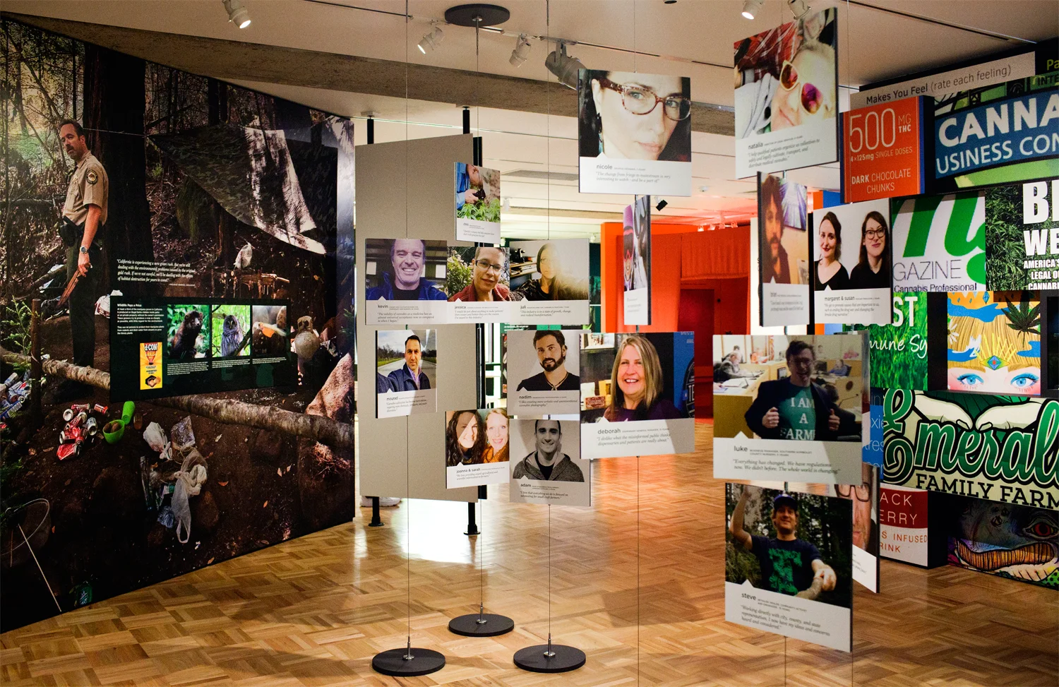
Known as the "selfie forest," these portraits hung in the middle of PROFITABLE POT? and reflect the wide variety of people who participate in the California marijuana economy (and were not ashamed or afraid to show their faces).
Opposite all the dollars to be made was a somber comment on the environmental destruction that results from the many illegal growing operations (hidden on both public and private property) that feed the demand.
MEDICAL MARIJUANA?
A clinical setting for the MEDICAL MARIJUANA section seemed like a natural fit. Walls were neutral doctor's office white with fluorescent lighting above recalling a 24 hour pharmacy. Cabinetry was bought off the shelf from IKEA and modified.
This series of medical illustrations were brought to life with the assistance of Tom Klump, and were based on vintage samples from the early 1970s purchased on eBay.
This ingenious interactive presentation of complex data sets was conceived and executed by Craig Hansen. For each medical marijuana study; green represented a positive correlation, red negative, and yellow neutral. The information the team uncovered in our research was surprising; for example, marijuana has long been assumed to aid those suffering from glaucoma, yet not a single scientific study supports this assertion.
The shelves were lined with empty prop bottles, adorned with simple medical crosses in a variety of colors and scales. The effect resembles the background cell of an animated scene; as gestalt they recede but support the overall presentation.
For the study cards in the drawers, the scientific vernacular is expressed through monospaced typography, as if output en mass by computer. Simple minus / equals / plus icons with their key colors formed a filing system.
A number of interviews were conducted with medical patients who use marijuana, and they were both presented as large format wall quotes, and audio recordings. Visitors were encouraged to contribute their own stories on a wall of small clipboards.
The "Dispensary Wall" serves as a counterpoint to the "Density Wall" on the other side. Both share the same objects in the same display vitrine; only the context has shifted. The medical side is as plain and stately as the profitable side is wild.
POLITICALLY LOADED?
One of the key motivations for this project's debut in 2016 was the fact that for the second time, marijuana legalization was to be on the ballot. The vernacular of California state election materials (bold sans serif typography, black and white with thick strokes and table fields) was employed for interactive elements in which visitors could consider a number of effects—from environmental to social—as a result of marijuana legalization and 'vote' accordingly.
Drawing on the Oakland Museum's ALL OF US OR NONE collection, these stripes of colorized posters (treated with the assistance of Tom Klump at intank design) were composed into a bare-framed wall of 2x4 studs, suggesting a voting location in a local garage.
This activity prompted visitors to create their own political lawn signs and literally "plant" them on a tabletop of AstroTurf. The "Ask an Expert" desk was where visitors could leave a question about marijuana policy which a guest speaker would address during a scheduled talk in the gallery.
EVIL WEED?
What are the cultural stereotypes we have of marijuana use, and how have those notions changed (or not changed) over time? The EVIL WEED section addressed this question head-on with a comprehensive timeline of quotes, graphics, reproductions, and objects.
The timeline was divided between two wall planes, each with their own title. "From Bad to Badass" charted marijuana's morphing from a 'tool of the devil' into the height of counterculture coolness, and "From Beneficial to Banal" showed how the medical marijuana movement lead to a more mainstream acceptance of the drug.
A tight grid of 'organized chaos' gave the presentation an organic, yet uniform, look. Wall quotes in cut vinyl were interspersed with panels, images, and artifacts.
CRIMINAL DOPE?
The CRIMINAL DOPE section sought to personalize the stories behind the statistics, by both presenting the biases inherent in drug policy laws, and inviting visitors to record their own experiences.
Large format information graphics dominated the space, printed on a translucent scrim. Tom Klump assisted in plotting the data and executing the initial designs.
The scrim was installed several feet away from the backing wall (painted yellow) which gave it a glow when lit. Centered on that back wall was a grid of photographs. They were pixelated both for effect (like a low resolution security camera) and to somewhat preserve the anonymity of the participants. The result is literally seeing the people 'behind' the data.
This chart pointedly placed the two peaks in felony and misdemeanor arrests in California's history in context of changing laws, and brought visitors up to contemporary policies of tolerance.
The vernacular of actual Oakland Police Department forms was the basis for Amanda Boesen's excellent design of the "Report on Police Activity."
More difficult for the public to visualize is the discrimination that permeates drug laws, both by race and class. Both are also tied to geographic location within the City of Oakland.
By spinning a "Wheel of Misfortune" visitors could imagine what might happen to them given certain circumstances. Consequences for drug use and possession vary widely by state, county, and even city.
SACRED GANJA?
It is a historical fact that people use marijuana as part of their spiritual and cultural practices, most notably on the Indian Subcontinent and later in Jamaica, where Indian immigrants brought the plant. Extensive video interviews with current Bay Area spiritual communities—from Catholic nuns to Rastafarians—personalize their stories of why marijuana is important to them.
These video were presented in a space that was well isolated from the rest of the gallery. A more intimate feel was established through materials, floor treatment, and lighting.
Text panels in this section offered an opportunity to integrate appropriate traditional Indian graphic elements.
RECREATIONAL REEFER?
The exhibit, being a balanced presentation, also required a celebratory space. A place for pop culture and for humor...for stoners! However it wasn't all fun and games. In the "Confessional," visitors were prompted to tell their darkest secrets, whether positive or negative, about marijuana. Responses were curated regularly during the run of the show for display on the wall. Responses ranged from "Marijuana helps me love my daughter more" to "I can't play music when my bandmates are stoned."
One of the artifacts I personally insisted on including was a poster from our collections by Rolly Crump, a famous Disney artist and imagineer. Back in 1960, Crump made a series of whimsical and delightful posters depicting Beatniks and their predilection for drugs for poster pioneer Howard Morseburg’s Esoteric Poster Company. This one plays off the universal symbol of the Cigar Store Indian as an icon for American tobacconists.
YOUTH AND WEED?

By partnering with a Bay Area high school, the exhibit team was able to listen to young people's views on marijuana, rather than tell them what to think. The results were surprising. All the content on the walls in this section was generated by students, and took the form of a poster series, photographs, and wall quotes (framed as mobile chat bubbles). A monitor in one corner played a running loop of government anti-drug PSA advertisements from the 1960s on through to the 2010s.
CREATIVE GRASS?
In a departure from the other content sections in the gallery, CREATIVE GRASS was the installation work of a single artist, Cybele Lyle. Asked to develop an experience about the altering of perception (the senses, time, and space), Lyle created a space she titled "A Parallel Once Removed."
The space was relatively isolated compared to the other content sections in the gallery. Upon entering, visitors experienced multiple digital projections of nature imagery, detached from the real world and recontextualized.
Just outside the artist installation, two large wall prompts asked visitors to "Draw Here If You're High" and "Draw Here If You're Not High." This interactive garnered responses that were both profound and absurd, but always interesting.
COLLATERAL
For communications collateral, the agreed direction was clean and simple. The icon set proved quite versatile for a number of applications, both in print and online.
Invitation for the Donor Forum exhibit preview.
Product
Although designed as a wayfinding device within the gallery, the icon set proved surprisingly popular as buttons. Visitors felt a sense of identification with the icons they chose to wear—cancer survivors might don a medical cross, a lawyer the scales of justice. The two biggest sellers, however? The iconic leaf, and the bong (naturally).
The tote bag, shirts, and glassware combine the wordmark for Altered State with a custom take on the "I Love California" Grizzly Bear by SF Mercantile.